
Emotions, In Type
Typography reshapes the way we communicate—not just what we say, but how it feels.
Words Piolo Cudal
Art by Martina Reyes
October 16, 2025

Words may be simple, fleeting thoughts. But typography gives them weight. In that moment, they’re no longer just text—they become feeling.
In the fast, flat world of online content, typography was once an afterthought, mostly invisible, barely noticed. However, on social media platforms like TikTok, it has become a deliberate design choice, used to convey tone, mood, and even vulnerability.
Typography now serves as a powerful form of emotional expression online because it carries part of the message. But how?
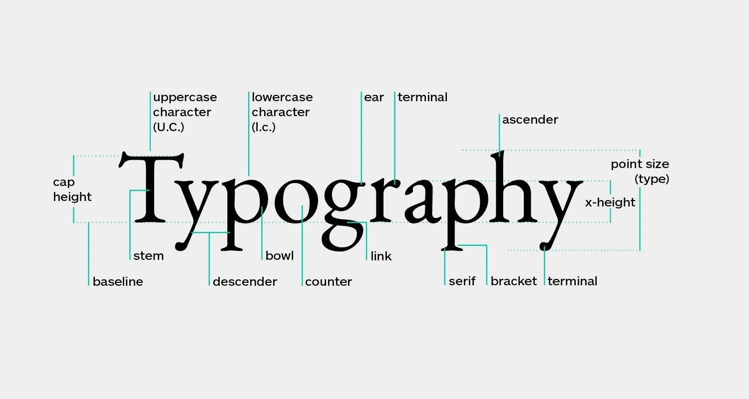
Photo courtesy of Shillington
Type as tone
In basic design principles, typography is more than just choosing a pretty font; it shapes how words feel even before they’re read. Broadly speaking, font families, called typefaces, fall into three major categories:
Serif: Used in traditional, authoritative write-ups and often associated with books or formality.
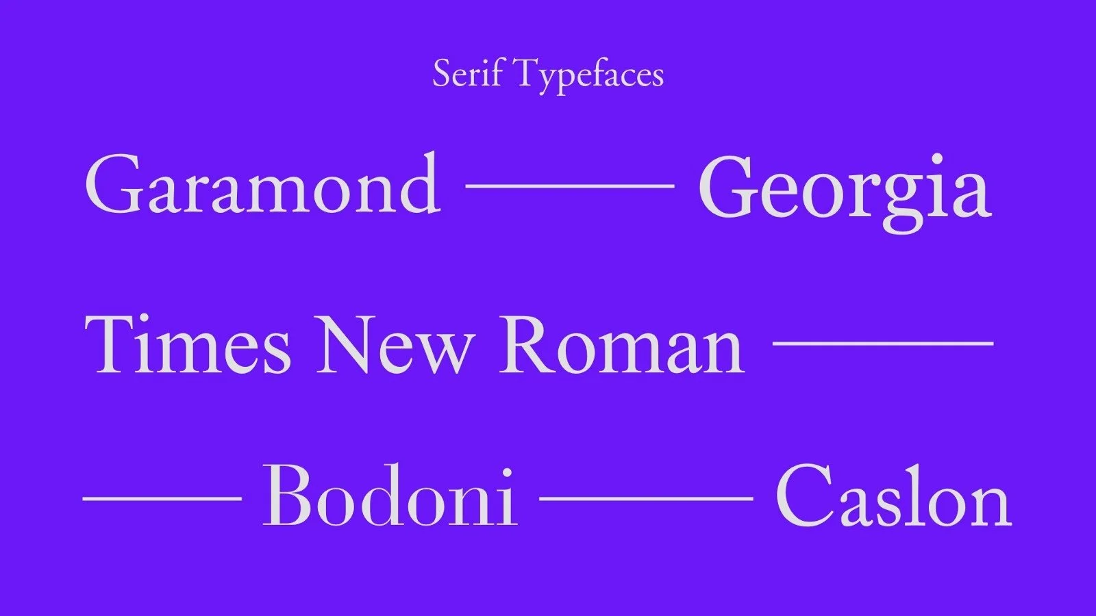
Photo courtesy of Monica Galvan
Sans-serif: For clean, modern, and neutral digital design.
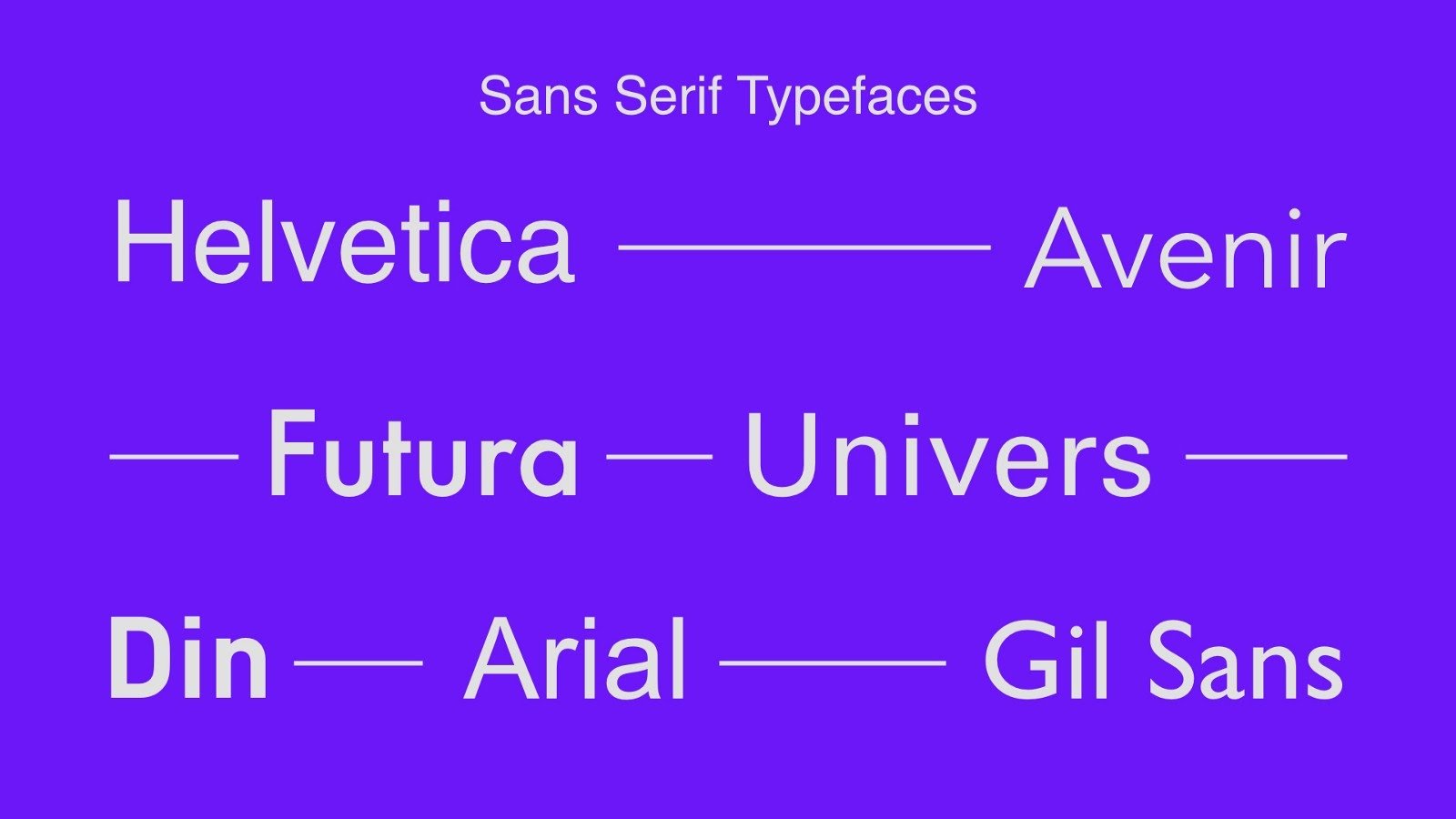
Photo courtesy of Monica Galvan
Display/Decorative: Flowing, handwritten, emotional, and feels personal and intimate.
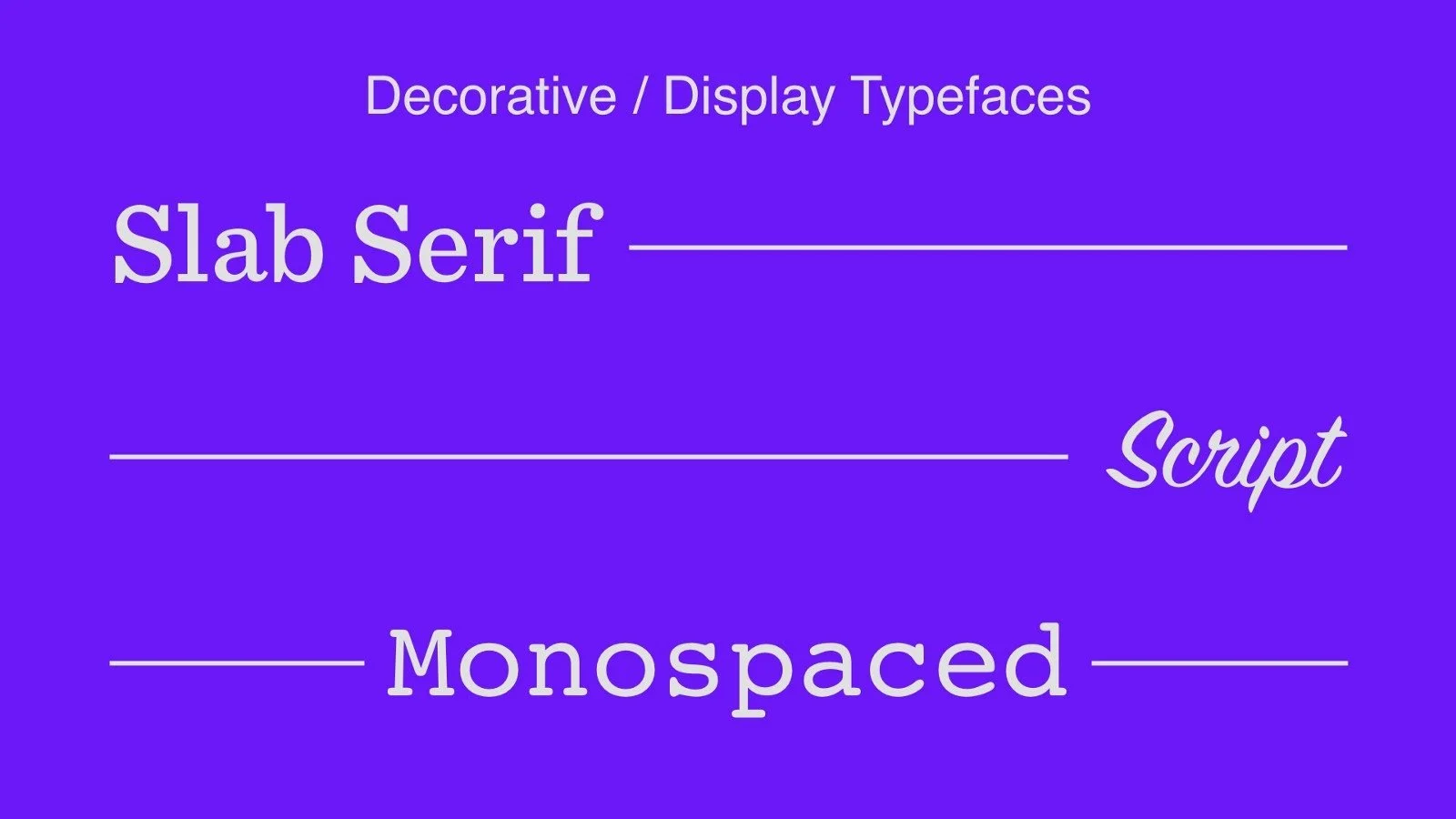
Photo courtesy of Monica Galvan
In most digital spaces, especially on social media, sans-serif fonts are widely used for their clean, no-frills efficiency. But display or decorative typefaces break through that simplicity with feelings.
When tone gets lost in the digital noise, typography often brings it back. As graphic designer Ellen Lupton puts it: “Typography is what language looks like.”
So why shouldn’t it feel something too? After all, font choices serve as the emotional undertone of a message, whether online or in print.
Designing for feeling
Among the dozens of available fonts, one display or decorative typeface has caught the interest of TikTok users: Italianno.
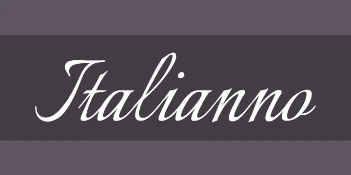
Photo courtesy of Font Squirrel
Unlike bolder or messier styles, Italianno carries a kind of visual restraint, marked by elegance and intentionality. In fact, people aren’t using it purely as a design tool. Instead, they pair it with TikTok’s “na para bang” trend, translated as “as if” in English, to express longing or desire, allowing them to articulate feelings they might otherwise struggle to say out loud.
Perfectly suited for an emotional soft focus, some users even pair the Italianno font with lo-fi music, grainy photos and videos, and introspective captions, turning the typeface into a visual cue for vulnerability.
There’s a reason it resonates. Even on text-saturated platforms, the way words look still shapes how they’re received. In both digital and print spaces, where body language and vocal inflection are absent, typography steps in to fill that emotional gap. Each typeface carries a built-in feeling.
Whether users realize it or not, emotional choices are made through typography. A well-crafted graphic, when paired with the right font, can drive millions in ad revenue. A book might default to a serif, but switch to a display typeface, and suddenly, the same words feel new—more expressive, more engaging.
Across platforms, this visual language is becoming instinctual. Just as people choose photo filters or background music, they now choose fonts not just for style, but for feeling.
In a world curated down to the smallest detail, typography has become part of how people express themselves. What was once a passive or purely aesthetic design choice is now a signal—something meant to be felt.
More than a stroke of lines
Choosing a font is never random. It’s a visual cue that deepens what’s being said.
More than a stroke of lines, the right typography can transform a phrase into a mood, a sentence into a full sentiment. Because sometimes, what one feels doesn’t need to be loud. It just needs the right typography to be understood.